In-network / out-of-network: I built this analytics early — and LinkedIn just shipped it, backfilled a year
LinkedIn announced an in-network / out-of-network reach metric, but wasn't showing it to anyone yet. I looked into the API and built my own version — first on data that wasn't exactly what was announced. Now LinkedIn has finally shipped the real metric, we have it alongside the earlier one, and along the way I found out how far back LinkedIn backfilled the data.

Rafal Szymanski
I implement LinkedIn and Sales Navigator in companies so they turn a profit.
I've been training people in LinkedIn since 2016 — more than 5,000 of them, across 200+ B2B companies. Founder of B2B Marketing.AI, a CRM platform for advanced LinkedIn users. I help sales and marketing teams turn LinkedIn into a predictable source of leads. I've spoken about LinkedIn at the biggest conferences, including I Love Marketing, InfoShare and Effie, and picked up a few awards along the way.
Published On Updated On

One evening, two posts by Sam Corrao Clanon from LinkedIn’s product team caught my eye. They announced a metric I’d been looking for in my analytics for a long time — one LinkedIn still wasn’t showing me. I decided not to wait for the official rollout and to build it myself. And then the story had a sequel I didn’t see coming: LinkedIn finally shipped that card — and backfilled the data a year. Here’s how it all played out.
What you'll learn from this article:
- what the in-network / out-of-network reach split is — and why it changes how you think about content;
- why I didn’t wait for LinkedIn to turn this card on for everyone — and what I honestly managed to build at the start;
- what changed once LinkedIn finally shipped the real post-reader metric;
- how far back LinkedIn backfilled the data — I checked it on our own accounts.
It started with two posts
In the first one Sam announced a new post-analytics metric: a percentage breakdown of your audience into those already in your network and those outside it. To quote:
„You’ll begin to see a percentage breakdown of who has seen your content, based on if they’re already in your network or not.”
The definitions were simple:
- In-network reach — the share of impressions from people already connected to you or following you.
- Out-of-network reach — the share of reach from people not connected and not following — a new audience reached through feed recommendations, reshares, search, and so on.
The card is meant to land in the Discovery section of post analytics, below the view count:

In the second post Sam shared his own result: a 20/80 split — 20% engagement from his direct network, 80% from outside it. He put it aptly: „a pure product announcement that has nothing to do with me or my opinions travels pretty broadly”.

This is exactly the kind of metric that changes how you think about content: does this post deepen relationships with my network, or open me up to new people? I thought right away: I want this in the analytics in our LinkedIn CRM, B2BMarketing.AI.
LinkedIn’s API: where is it, even?
First step — check whether I even have something to work with.
I opened my own post analytics on LinkedIn. Not there. I checked a few other people’s profiles I have access to in our platform. Not there either. The feature Sam announced as „rolling out globally over time” simply hadn’t reached us in the interface yet.
At that point I could have stopped and waited for LinkedIn to turn the card on for everyone. But since we work directly with the internal API, I asked a different question:
If the interface isn’t showing it — is the data already in the API?
Honestly: I found network data, but not the one Sam meant
And here’s an important confession, because I like stories that are true, not smoothed over to fit a thesis.
I started digging through the responses of the endpoint we pull data from. And there, in the profile viewers section, was a breakdown by network distance:
- how many profile viewers are 1st-degree connections,
- how many from the extended network (2°/3°),
- how many outside the network,
- how many remain anonymous.
Notice: this was data about who viewed your profile, not about who read a specific post. And Sam had announced the latter — the split of a post’s reach. It’s not the same metric. But it was the closest thing actually sitting in the API at the time — a solid, honest proxy for the question „how far past my network do I reach?”. I decided to take it and build a full feature out of it, rather than wait for something that wasn’t there yet.
It’s not the first time I’ve seen this with LinkedIn — collecting various data but not presenting it to users. The same happened with LinkedIn Save and Send stats, which I presented at the I Love Marketing conference a few months before the rollout for everyone.
The first feature: „Audience by network” — who’s viewing your profile
We extended our analytics pipeline so that on every run it collects and stores in the database:
- four total counters of profile viewers: your network (1°), acquaintances and strangers (2° and 3°), plus hidden profiles,
- a snapshot of the viewers list, because I have an idea for a feature showing the biggest fans of your content.
We show it to users as a pie chart split into percentages — even though I remember that pie charts send you to the corner, as Janina Bąk would say.
What mattered to me: it’s a richer split than the binary in/out-of-network from LinkedIn’s announced card. Instead of two values we have four levels of distance, so you can see not just „in network vs. outside”, but also how much comes through the extended network (2°/3° — the effect of reshares and recommendations), and how much stays fully anonymous.
Here’s the profile-viewer split for a real account (B2B Marketing.AI):
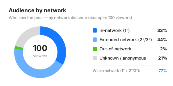
So: 33% are direct connections (1°), 44% extended network (2°/3°), 2% truly out-of-network, and 21% remain anonymous. It’s a good tool — but I kept in mind that it talks about profile viewers, not the readers of a single post.
The plot twist: LinkedIn finally shipped the real card
And here’s where the second part of this story begins — fresh, from this week.
The metric Sam announced finally showed up for real — not just as a promise, but as actual data in the API, per post: what share of a given post’s impressions comes from your network, and what share from outside it. Exactly what was on his Discovery-card screenshot.
We wired it into our analytics as the „Audience” preset: next to „Audience by network” (who viewed the profile) you now also get in-network / out-of-network reach for every post (how far a specific post travelled). So we have two pictures at once — who’s watching you, and how broadly your content spreads.
What these numbers actually show
You can see it best on my own posts. Two extreme cases from the rafalszymanski account:
| Post | Impressions | In-network | Out-of-network |
|---|---|---|---|
| „A phone rings: LinkedIn blocked my account…” (2025-06-09) | 105,125 | 12% | 88% |
| „Today is Workaholic’s Day…” (2025-08-12) | 43,569 | 23% | 77% |
| „Today I’m on TV twice…” (2026-03-12) | 1,705 | 98% | 2% |
The pattern jumps out immediately. The post about a blocked account — a story the whole of LinkedIn relates to — travelled outward: 88% of reach from outside my network, over 100k impressions. The post about two TV appearances in one day — more niche, more „mine” — stayed in-network: 98% in-network, 1.7k impressions. On average my posts split roughly 56% in / 44% out — but it’s those extreme cases that say the most about which content breaks the bubble and which deepens it.
A curiosity: LinkedIn backfilled the data a year
This surprised me the most, and I figured it was worth sharing — because hardly anyone checks it.
When a new card shows up, you might assume the data counts „from now on”. Nope. I checked it on our accounts that already got the feature, and there’s a hard cutoff around the end of May 2025:
- posts published before ~27 May 2025 — zero in/out-of-network data,
- posts after that date — covered ~96%.
On accounts that already have the metric, no post from before that line has the split, and almost every later one does. In other words: LinkedIn recomputed reach retroactively for about 13 months and attached it to old posts. Which means when you get this card, you get a year of history to analyse right away, not just fresh posts.
Second thing: it’s not for everyone yet. Of the 26 accounts we monitor in our platform, only 10 have the metric so far. That’s consistent with how LinkedIn usually rolls out novelties — selected users first (often paid accounts), then possibly the rest.
Engineering puzzles for nerds
Because it’s never as simple as on the slide:
- LinkedIn likes to complicate things by obsessing over details. Checking data on specific profiles, we found that your connections aren’t always stored as 1° in the database, but as a combination of whether the contact is a Follower or not. You can confirm it by checking whether you see Connect or Message on the profile — but that’s another step in the process.
- Chaos in how the data is stored. Basically a continuation of the previous point. Checking the data closely, we found that LinkedIn reports such optimistic values, inflates them so much, that the sums come out over 100%. Technically it’s a matter of the data being written several ways (why?), but along the way I caught that it also affects post-view stats and demographics. I fixed it and reported it as a bug, but I don’t know whether it’ll be fixed — because if your stats drop even further, nobody will want to publish on LinkedIn anymore.
What’s in it for you
- Data comes before the interface — but the interface sometimes catches up. When LinkedIn announces a „rolling out” feature, the raw numbers are often in the API earlier than the place for them on the page. It’s worth checking the source before you start waiting. But it’s also worth being honest about exactly which data you’re working on — for me the start was profile viewers, and only now did the real post-reach metric arrive.
- You get two pictures at once. „Audience by network” tells you who’s viewing you (profile-viewer distance), and in/out-of-network reach tells you how far each piece of content travelled. Together they answer the question: are you building depth or reach?
- The history goes back a year. When LinkedIn turns this card on for you, you’ll likely get data backfilled to ~May 2025 — there’s something to analyse right away.
- This data won’t be for everyone immediately. As with Save, Send or Link Click — selected users first (usually paid accounts), then possibly the rest. For us, 10 of 26 accounts have it so far.
- It’s worth reading posts by LinkedIn employees.
For now, I invite you to test our tool that helps you work with your LinkedIn — with both metrics in one place.
This post is based on the rollout of the „in/out-of-network” feature in our analytics platform: first the profile-viewer split (June 2026), then the real post-reach metric once LinkedIn shipped it (July 2026). The retroactivity figures and post examples come from real data on our accounts. Inspiration: Sam Corrao Clanon’s posts linked above.
Maybe we can do something together?
If you like what I write, maybe I can write something for you?